
What will my text look like later?

Guidelines
- Short lettering needs guidelines to keep the marker running stable.
- Guidelines can be bypassed by filling the spaces. More on this below.
- Basic rule: Visible gaps in short text must either be filled or closed by guidelines.

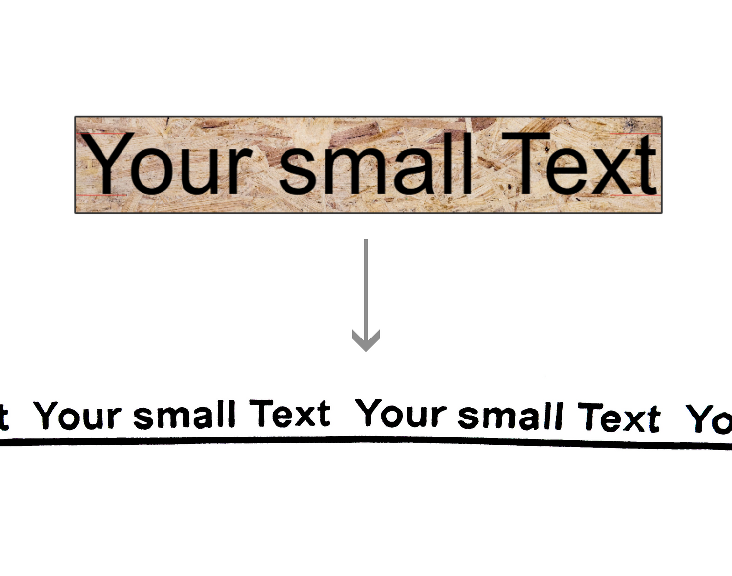
Non-stop
- Words are placed directly next to each other – no guidelines are needed.
- If the text reaches the full width, it can be repeated several times in a row.
- Requirement for NonStop: The text must be slightly smaller than the maximum height, otherwise gaps will appear.

Replace spaces
- Replace spaces with symbols like /, • or your own icons.
- This ensures that the marker runs stably, and the pressure remains constant.
- Alternatively, submit SVG files for custom shapes (e.g. hearts or logos).
- Note: Very fine details or thin lines cannot always be implemented technically.
Underscore
- By default, a continuous underscore is used for long texts to visually separate the text with several spaces.
- Long texts often don't require guidelines because the spaces between the words are small enough. We can test this for your text upon request.
- Check the text size in the preview tool: Small text must not be below the red lower limit.

Inverted
- Due to the manufacturing process, inverted designs create a small gap between the words due to the different creation, even if the text, such as INVERTED, fills the full width of the area.
- If the text is to run continuously without any visible spaces (non-stop), the word must be slightly longer than the preview window.
- Let us know if you need to add extra spaces at the end of the word(s) so we can customize the design exactly to your liking.

Style selection
- Guidelines
- Non-Stop
- Replace spaces
- underscore
- If nothing is selected, we will find the best option for you.